

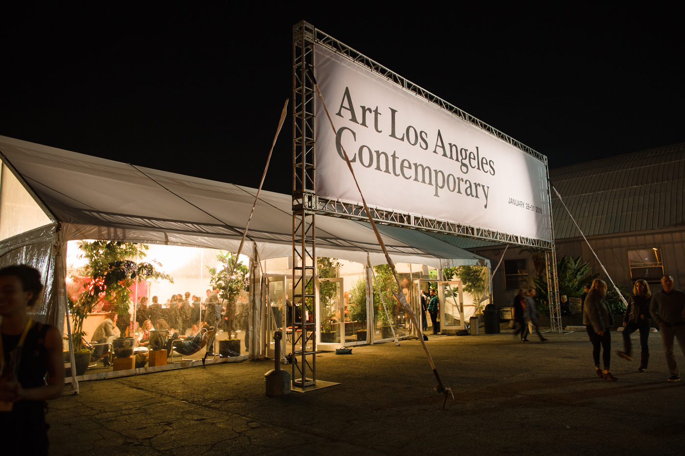
2016
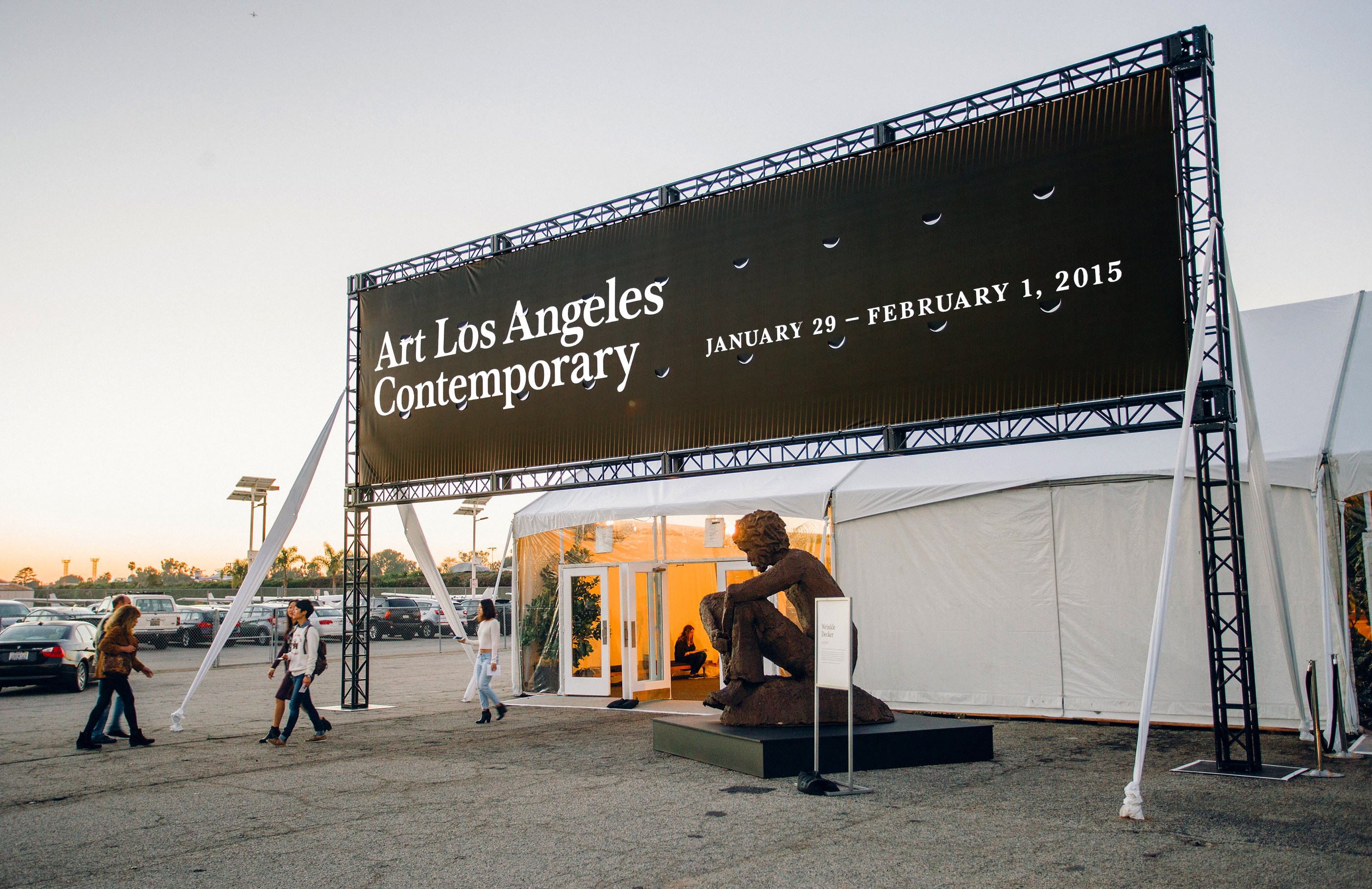
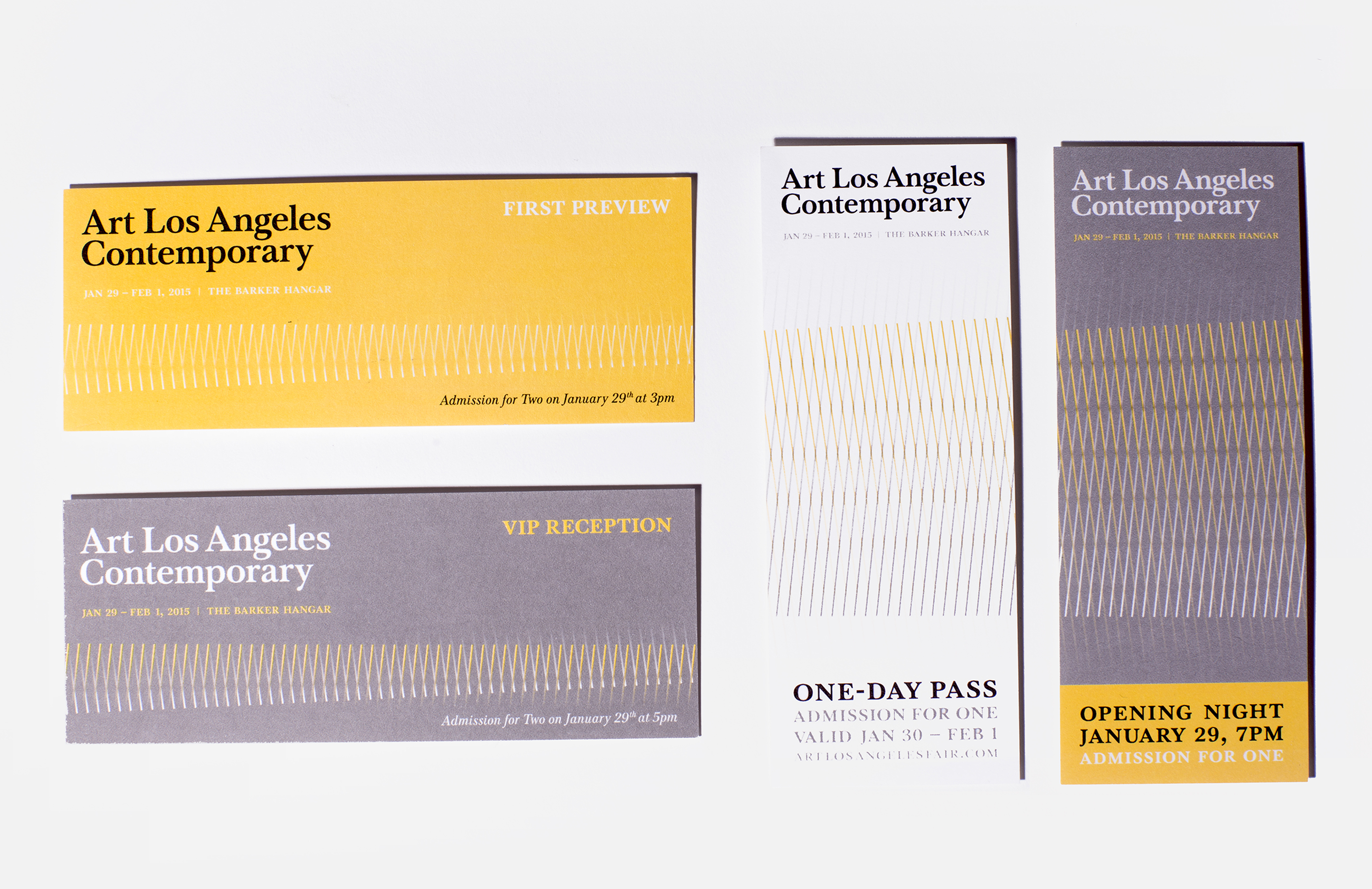
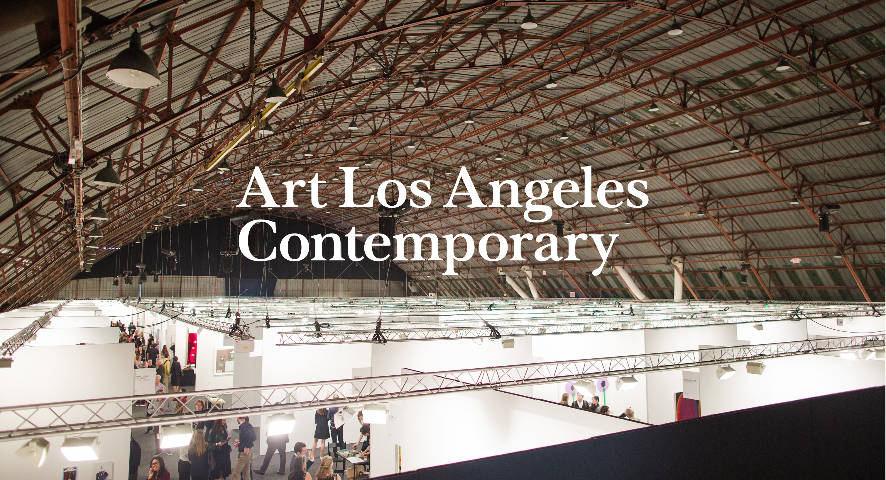
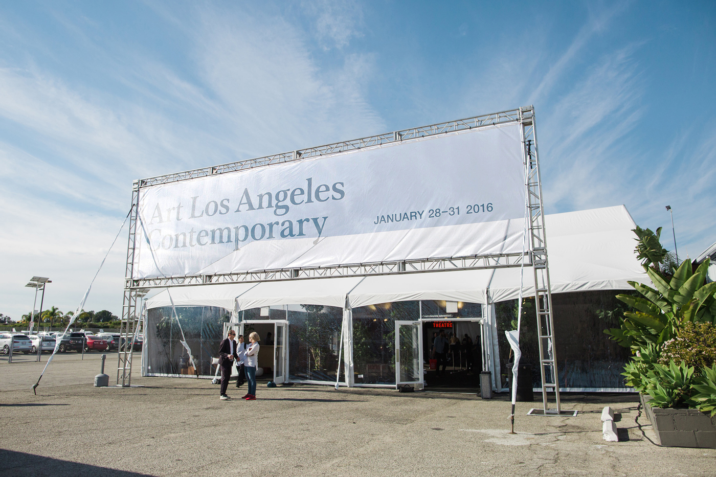
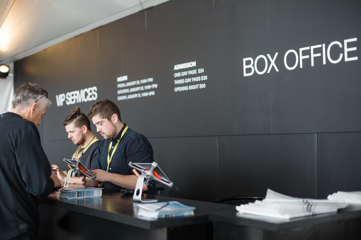
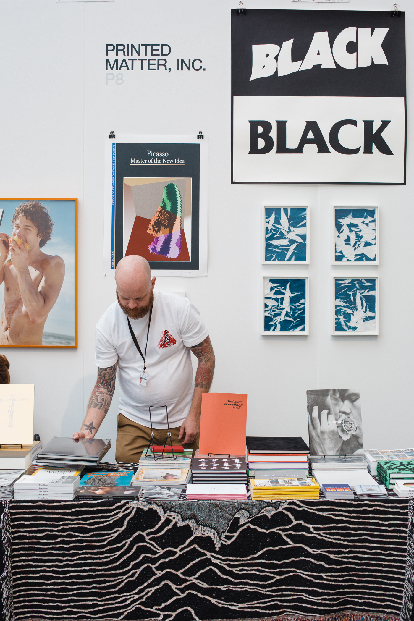
Fair exhibition identity. Design direction for graphics/title treatment, didactics, wayfinding signage, ticketing, print ads, invitations, merchandise, and various collateral.
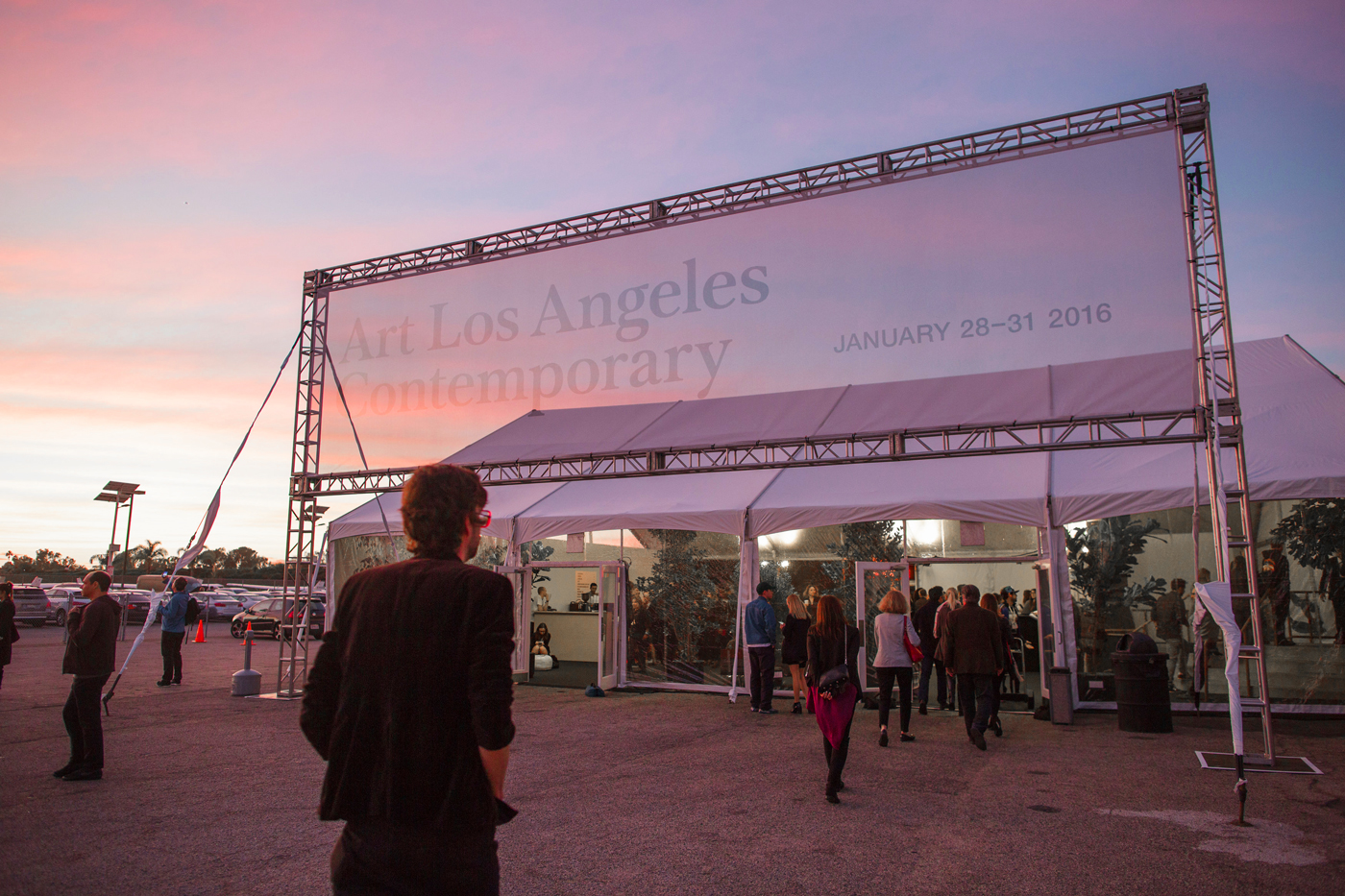
Fairground imagery courtesy of Gina Clyne.
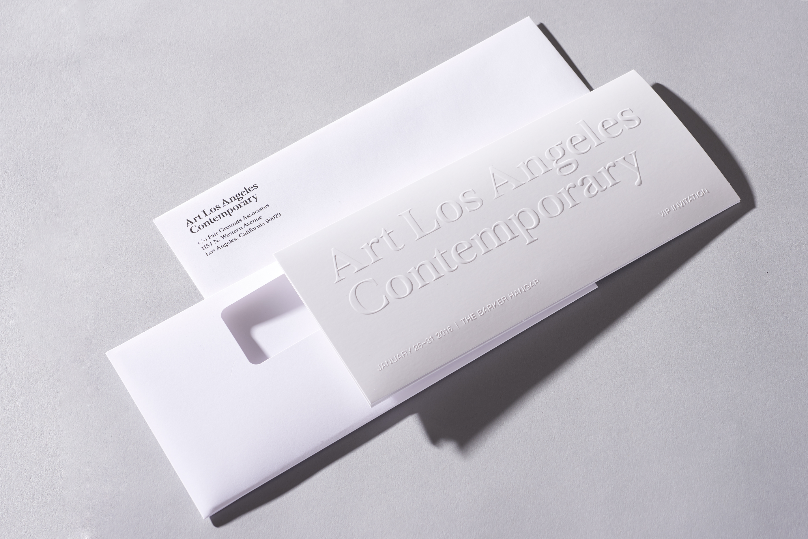
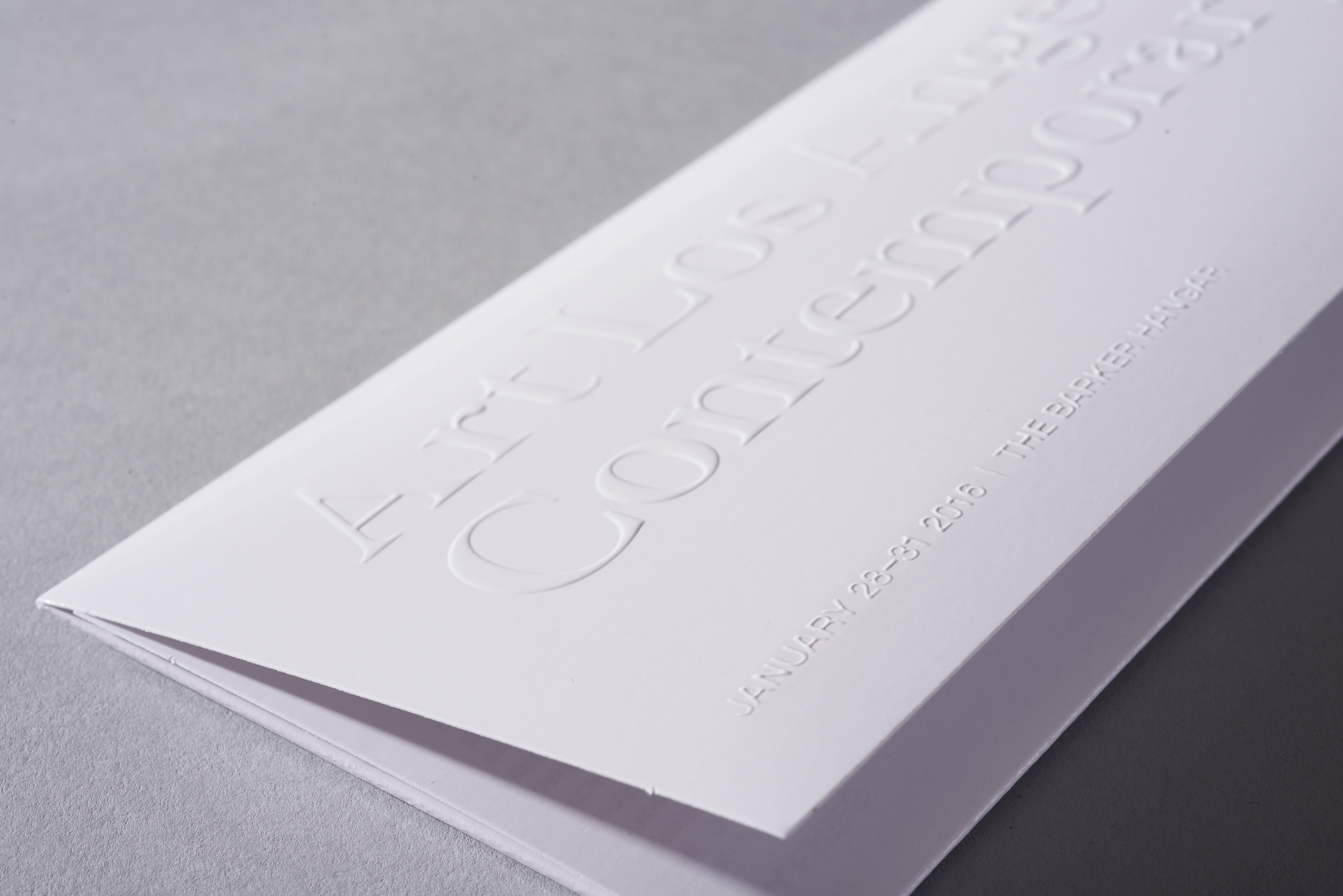
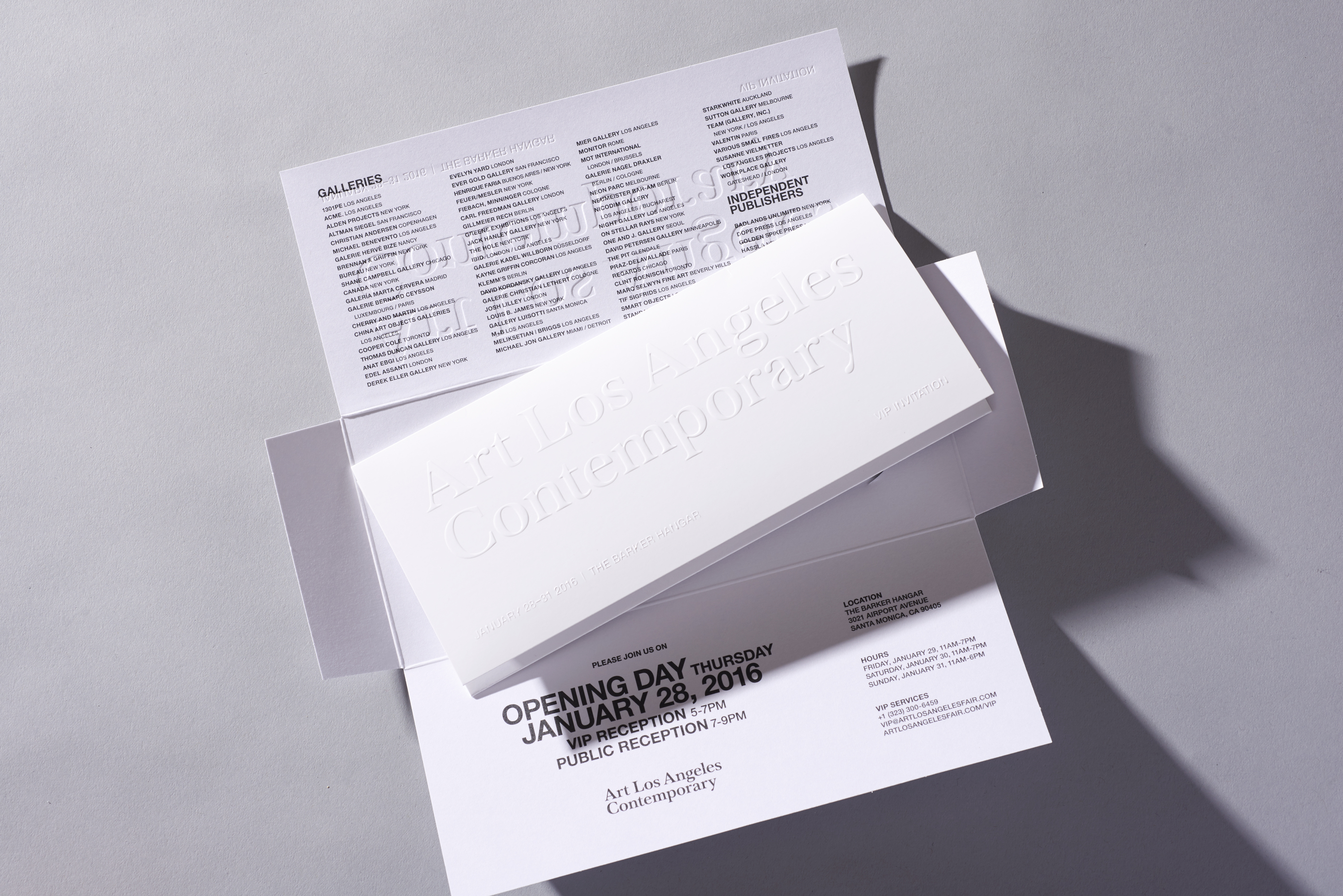
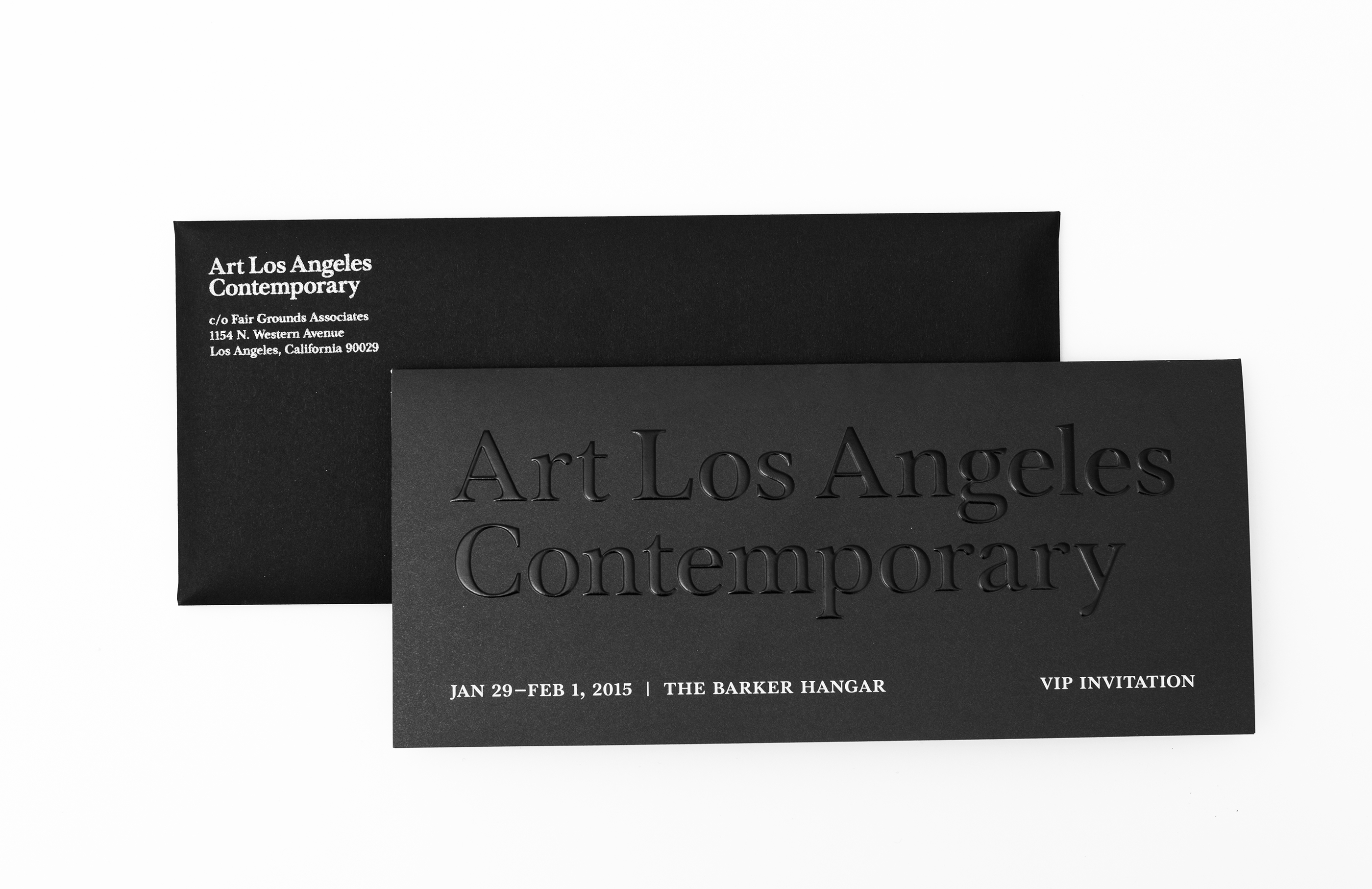
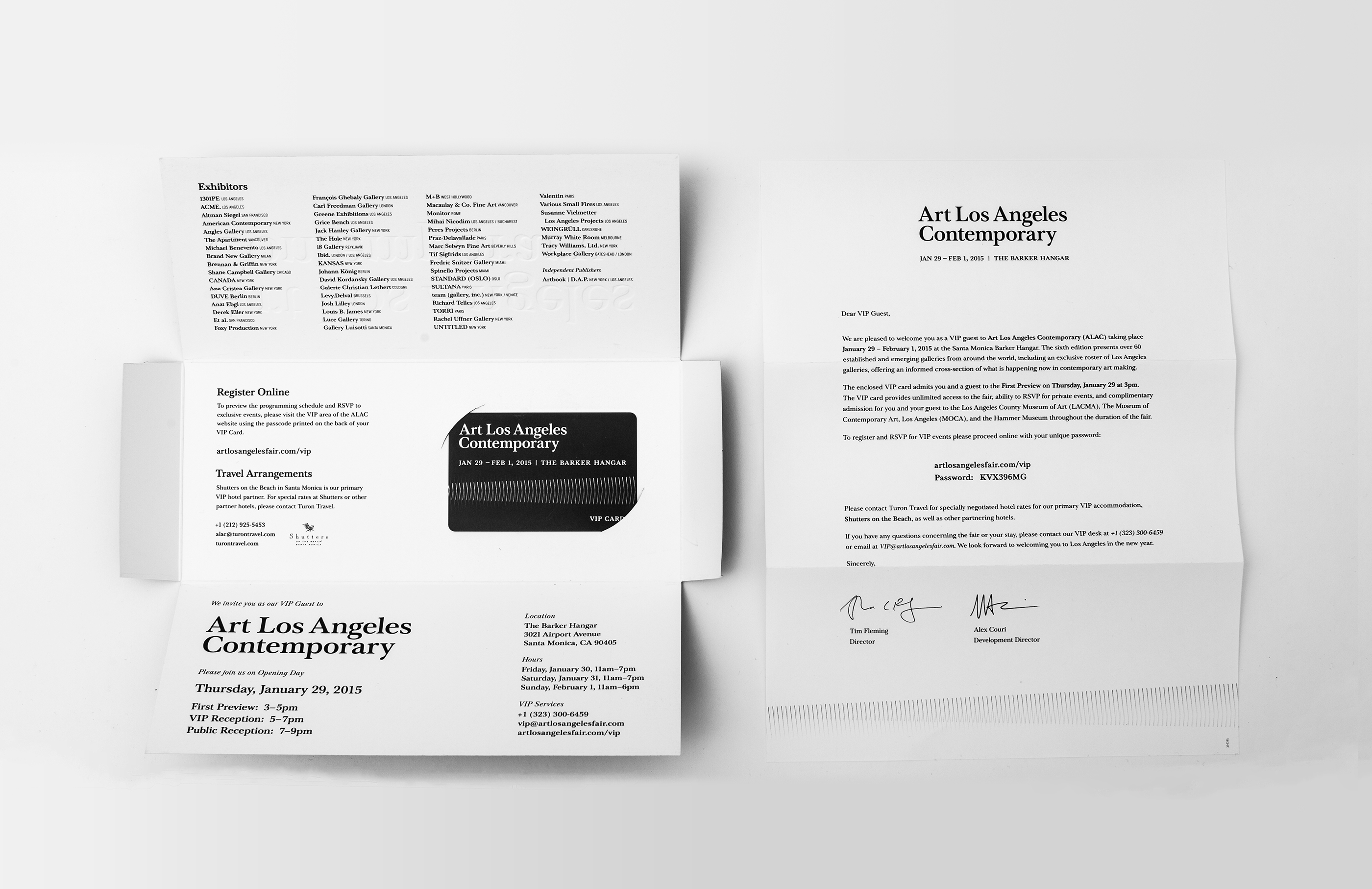
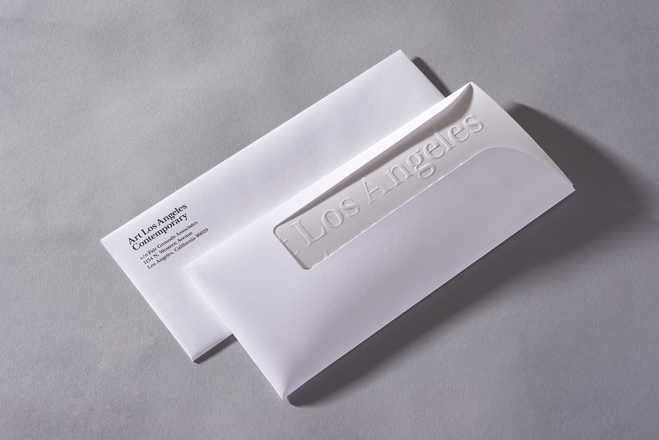
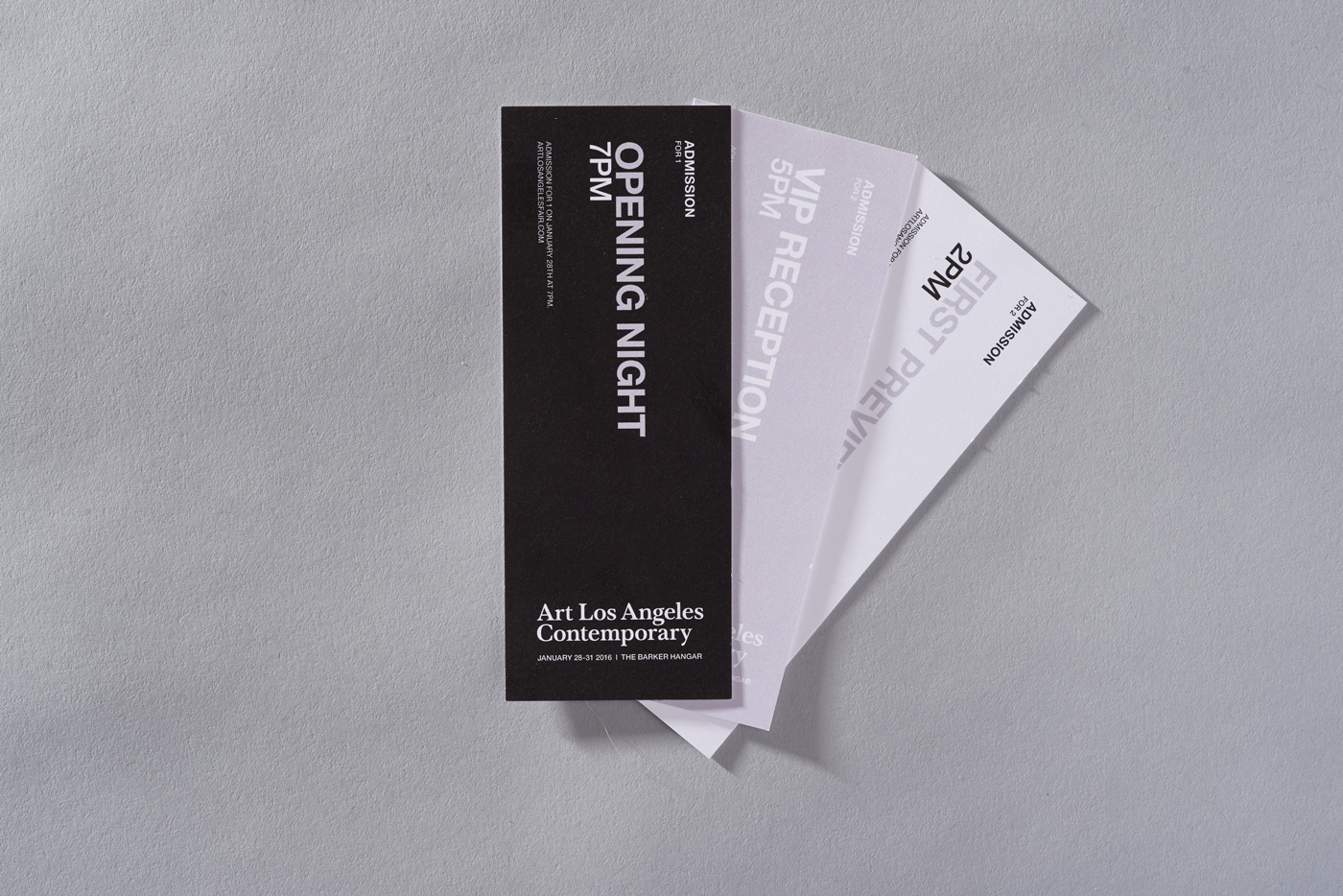
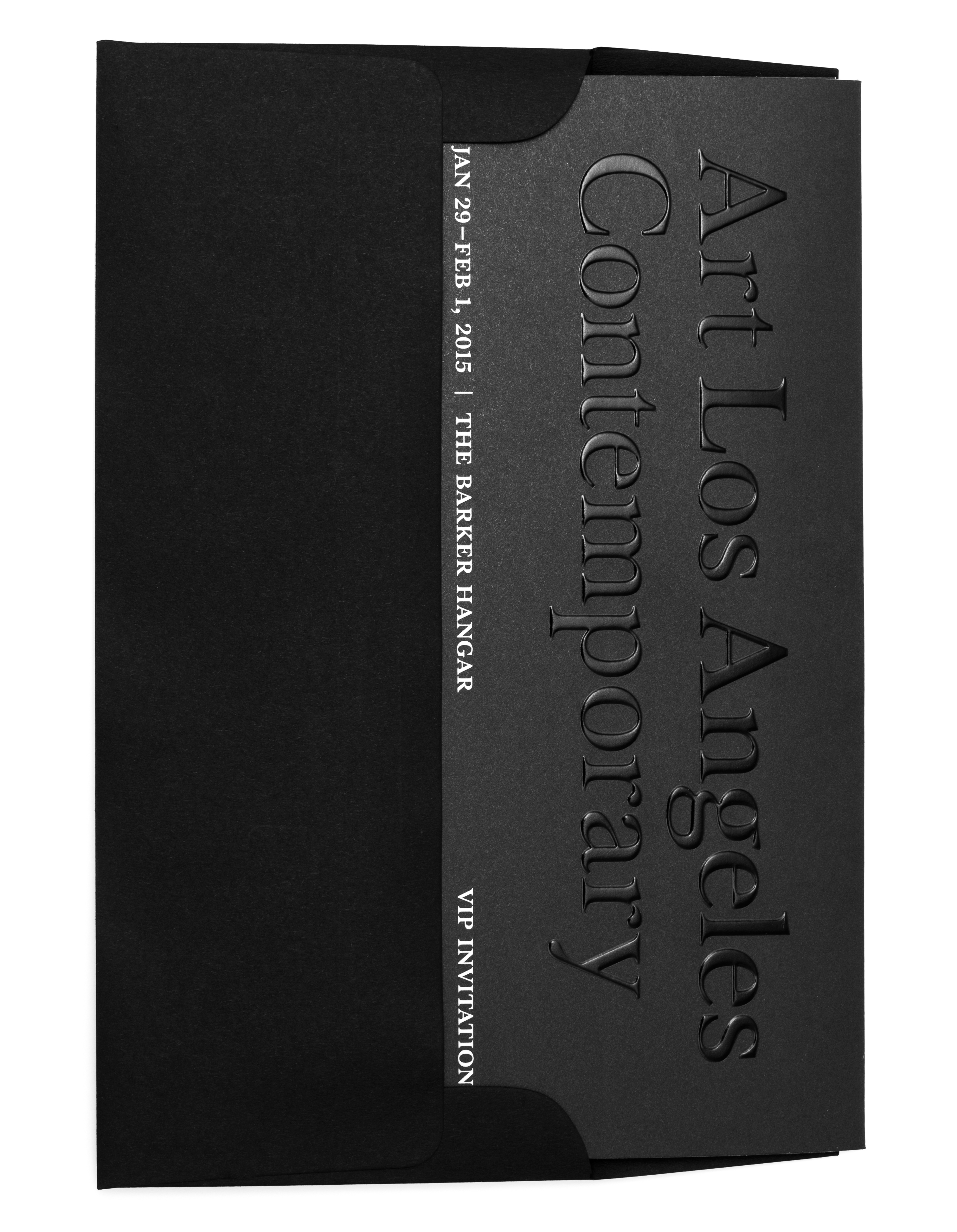
9 × 16 inches (folds down to 9 × 4 inches), multi-component VIP mailer, blind embossed with a spot AQ coat. Die-cut sleeve with plastic card insert.
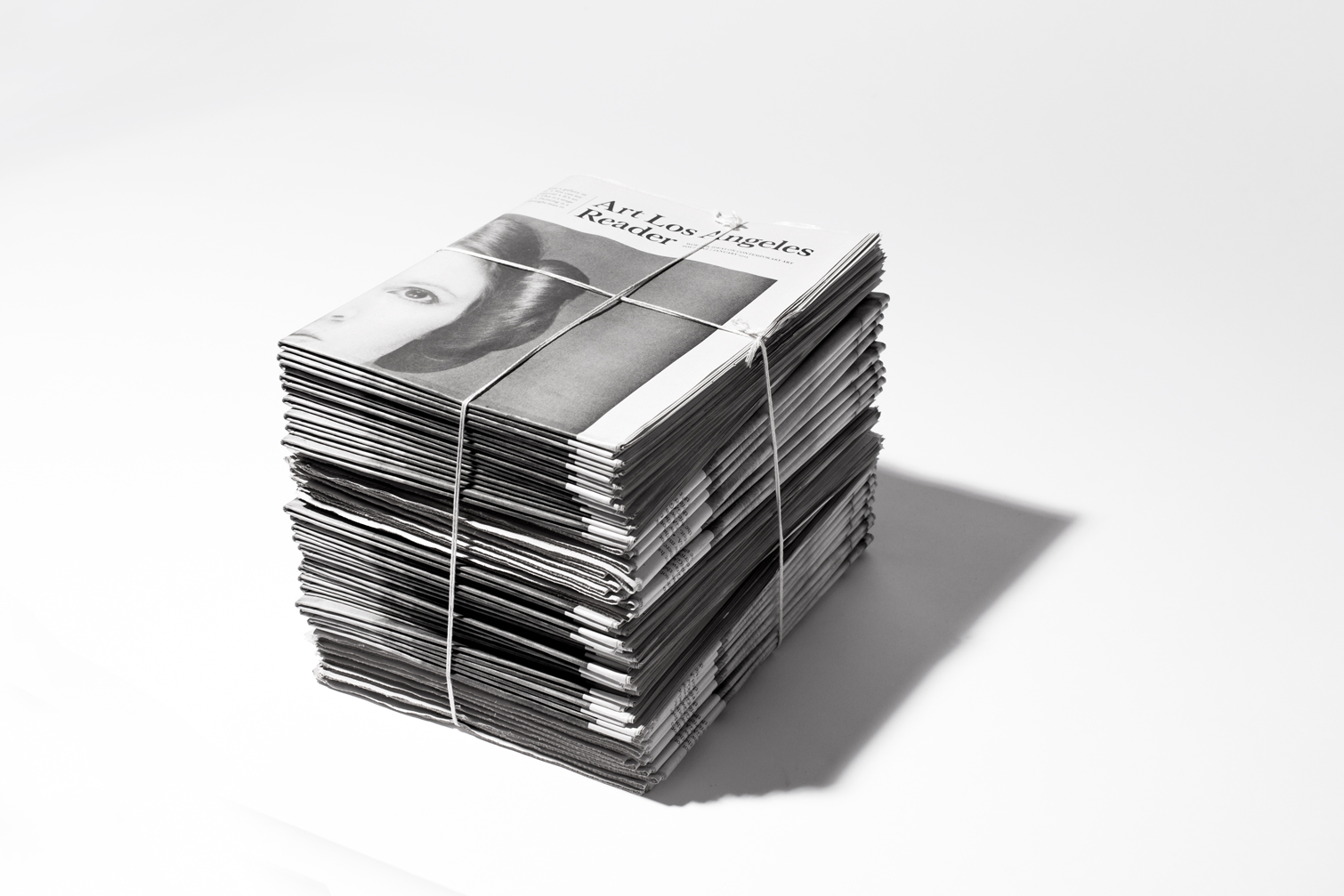
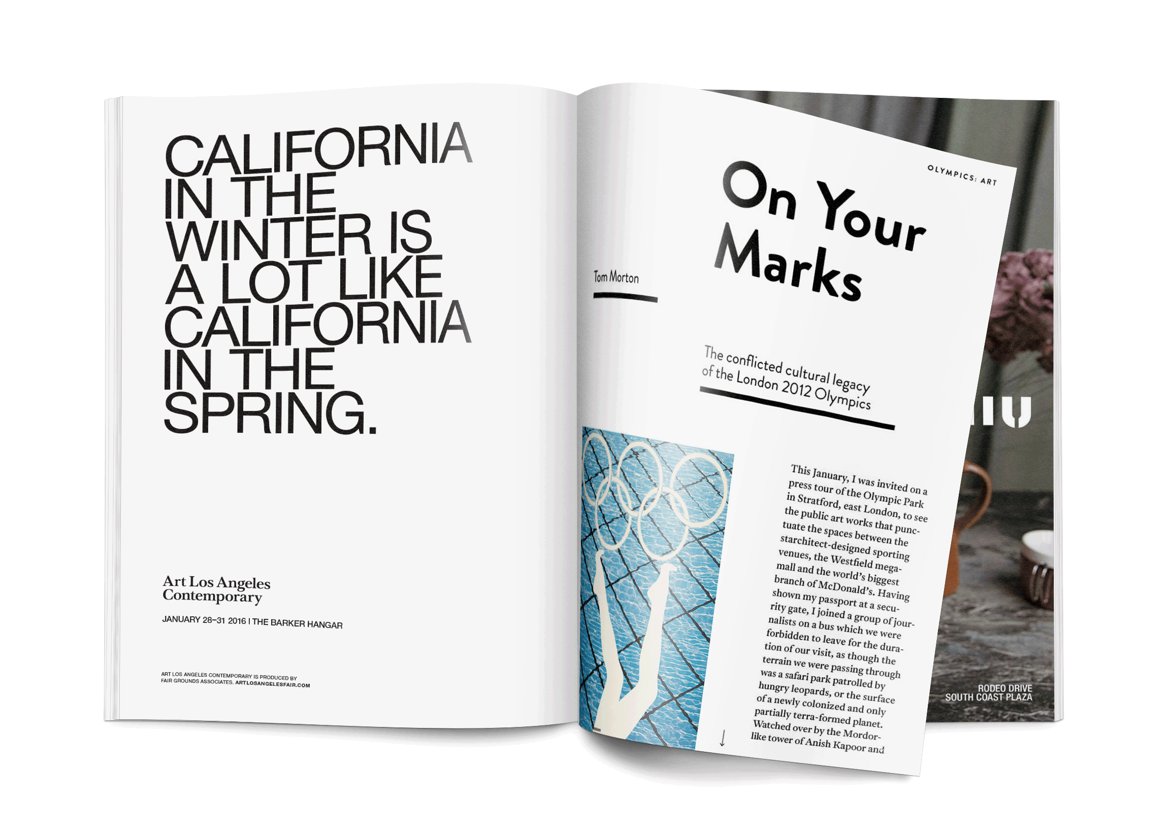
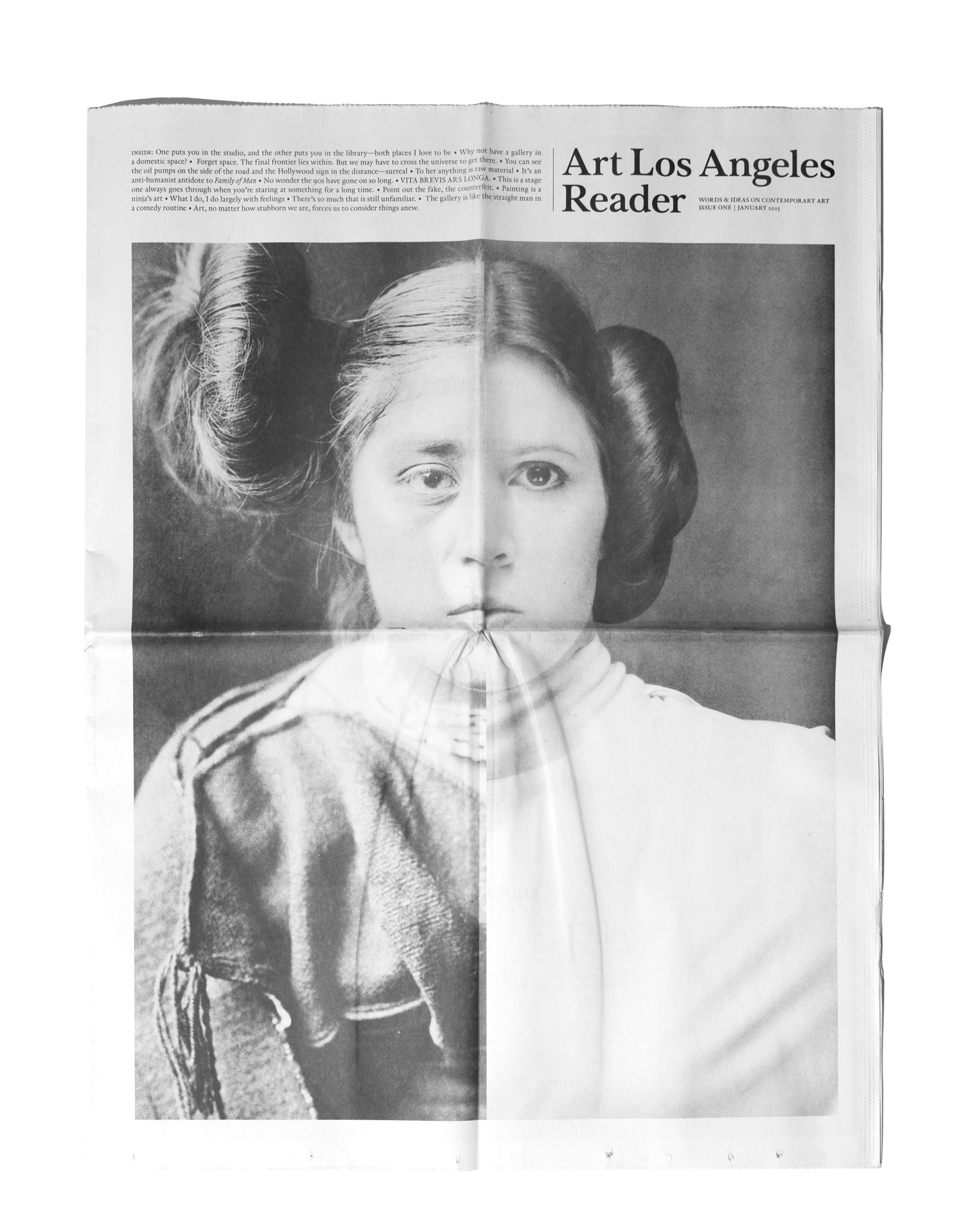
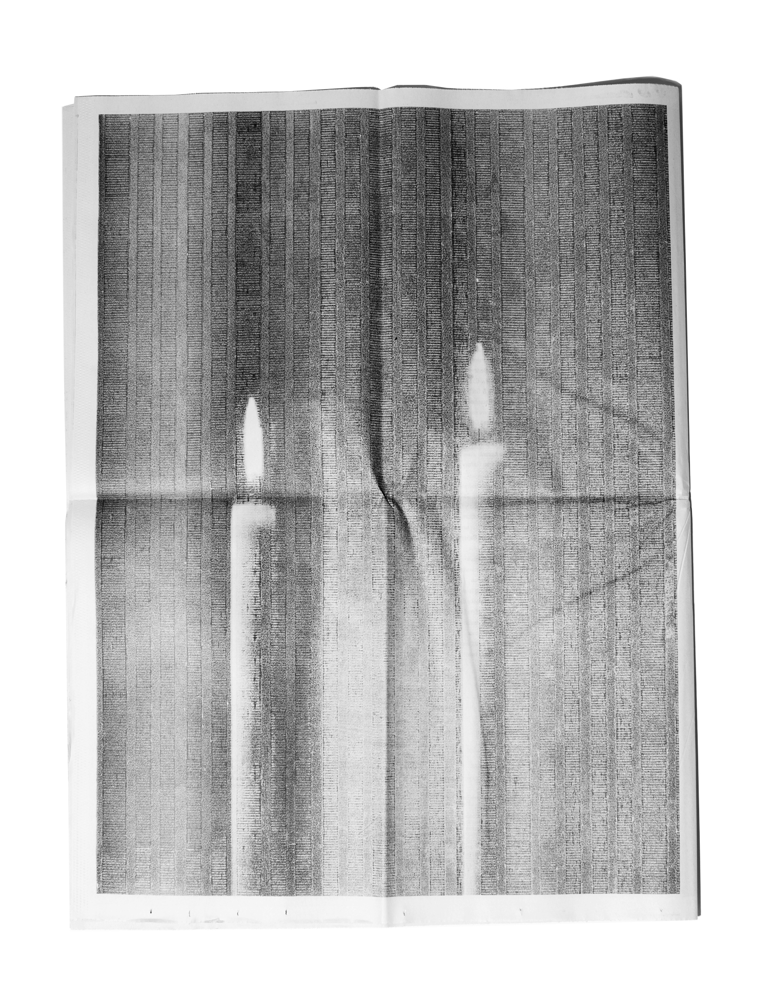
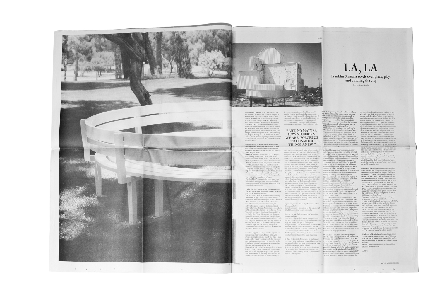
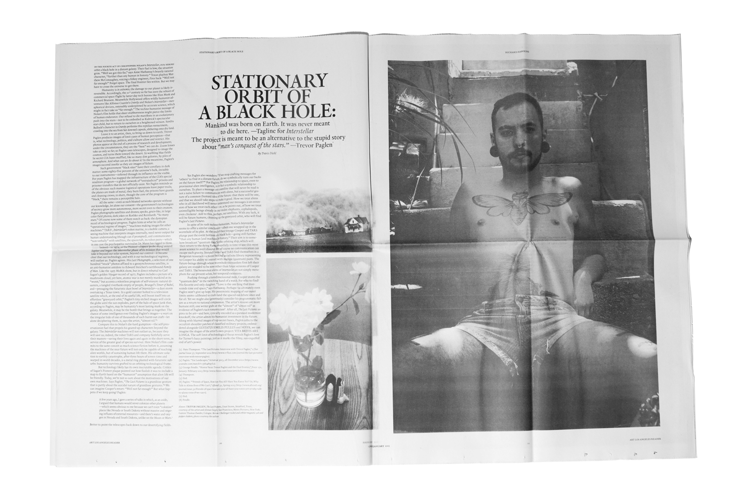
ART LOS ANGELES READER
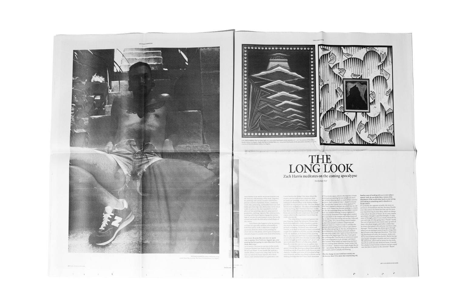
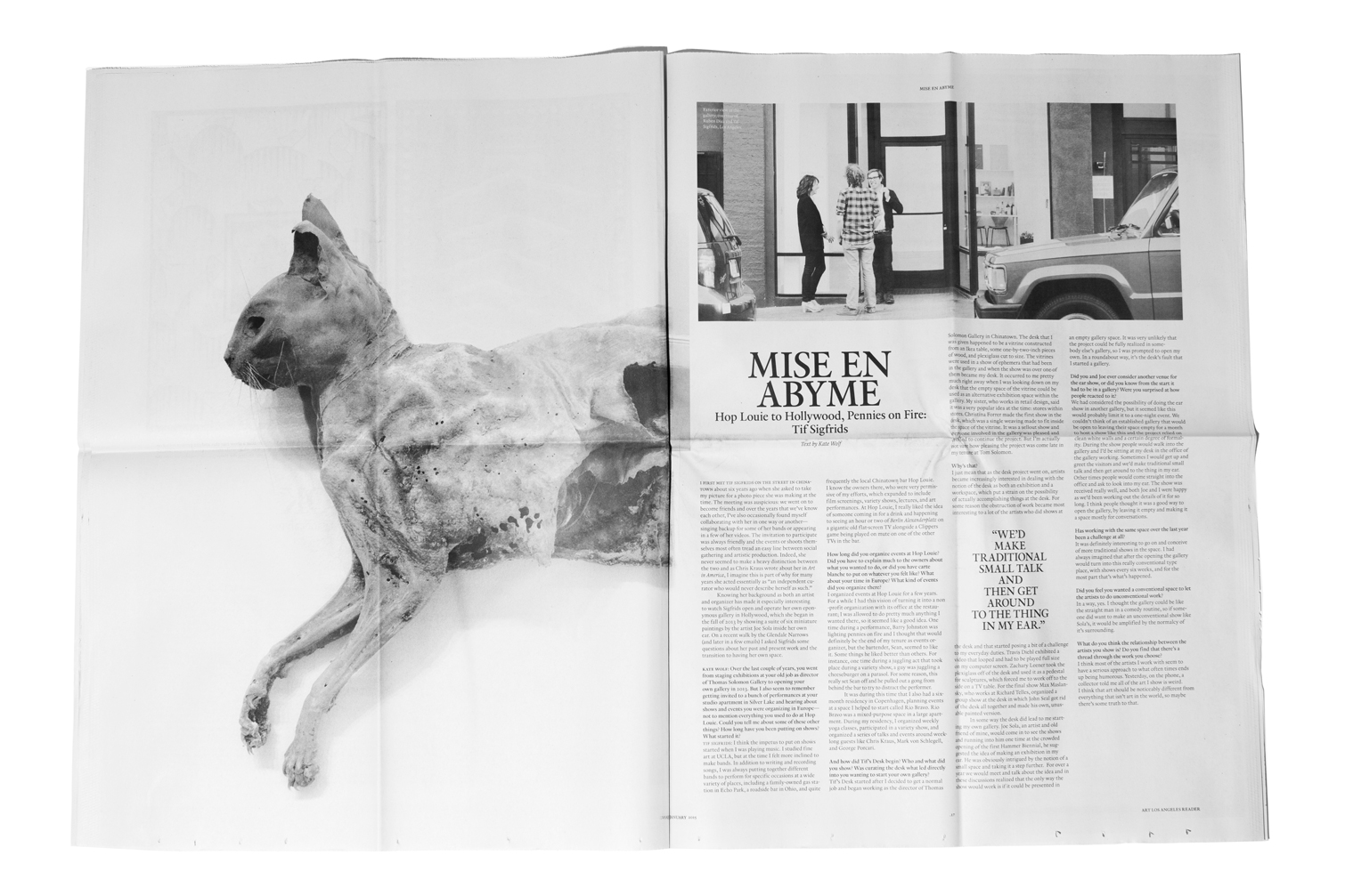
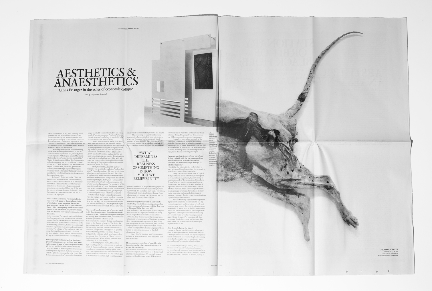
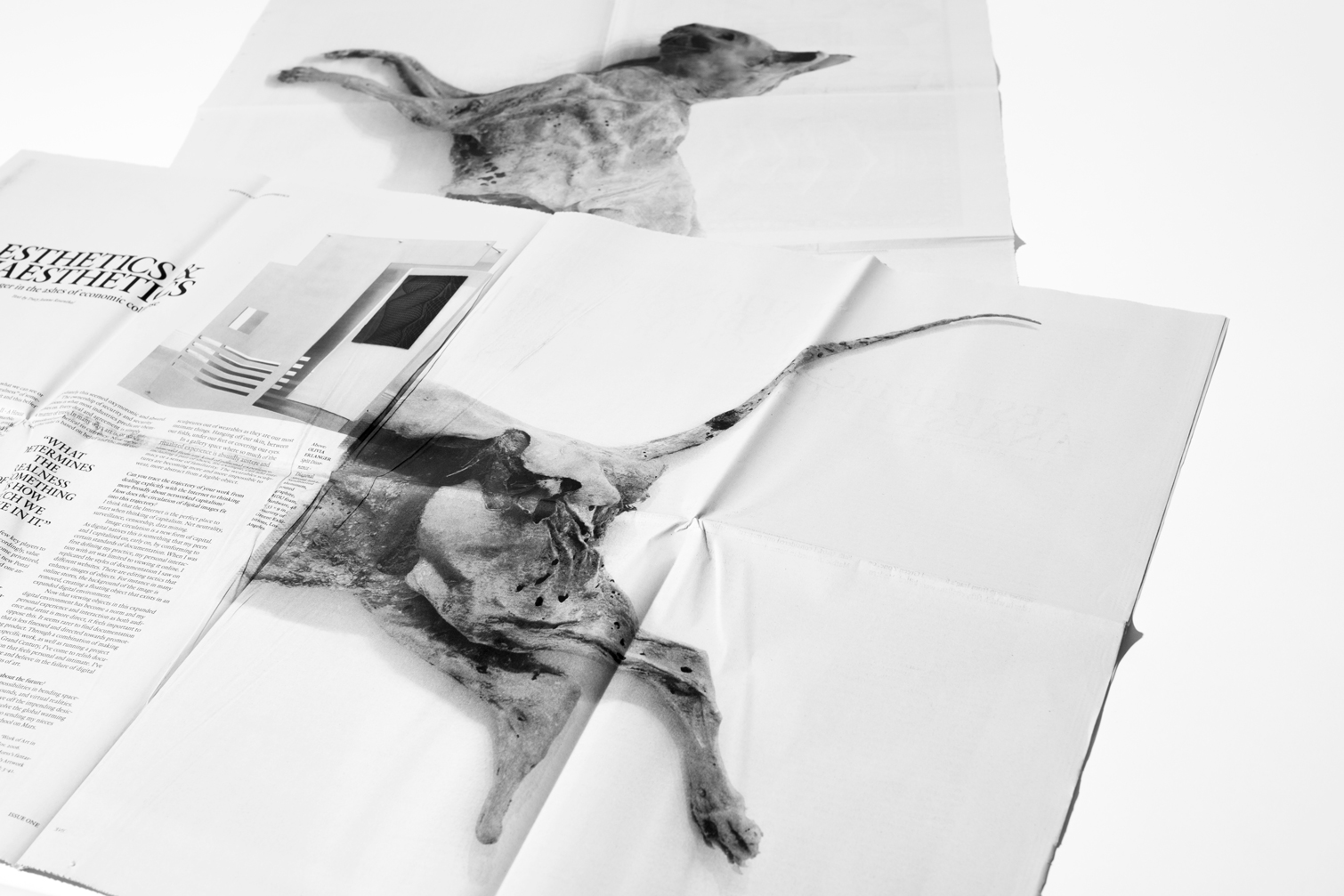
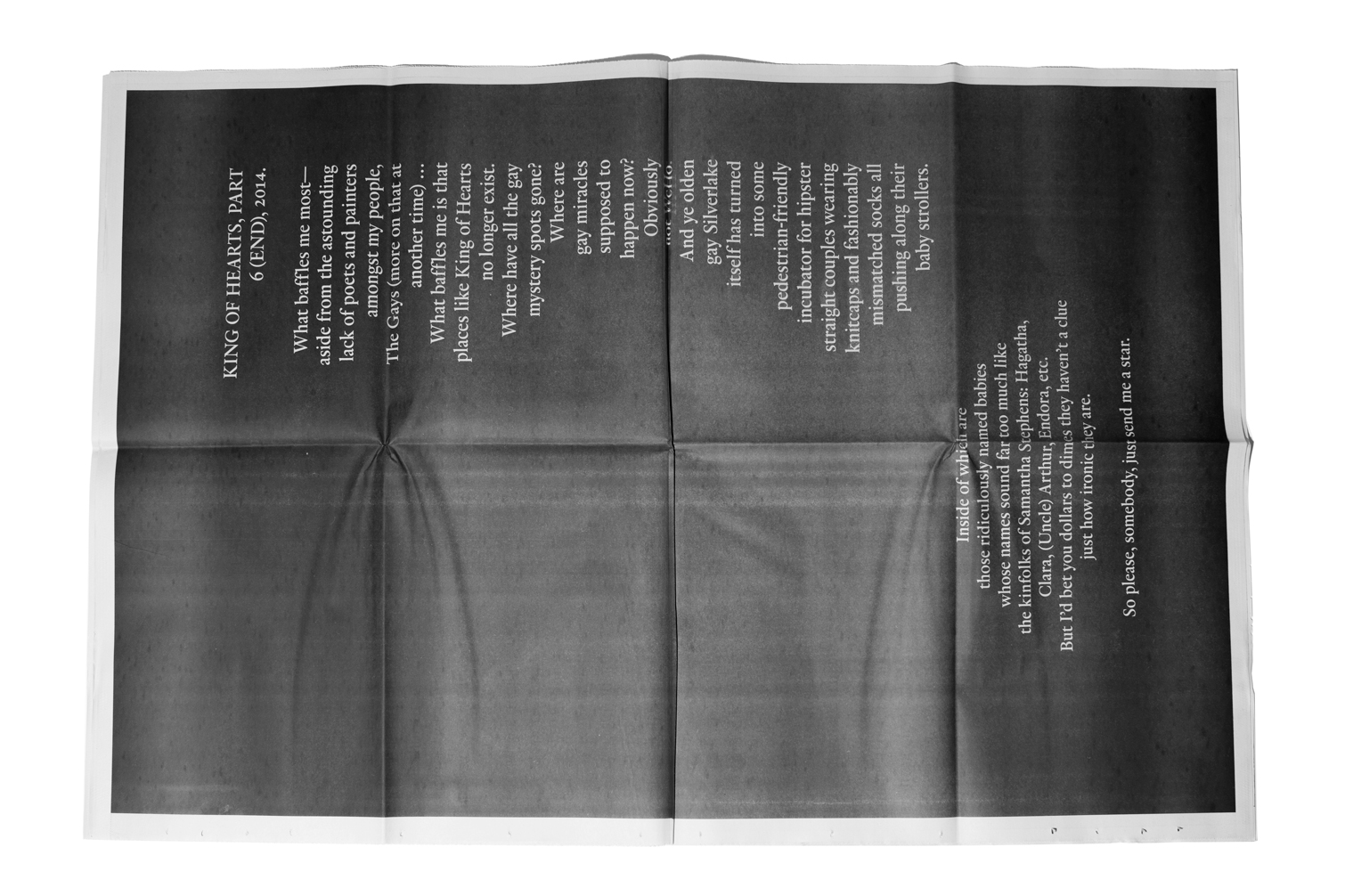
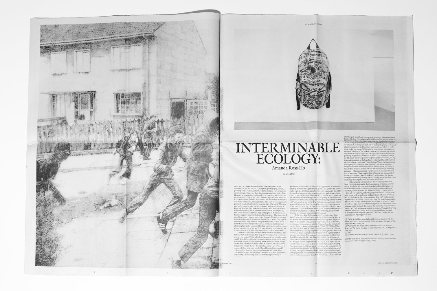
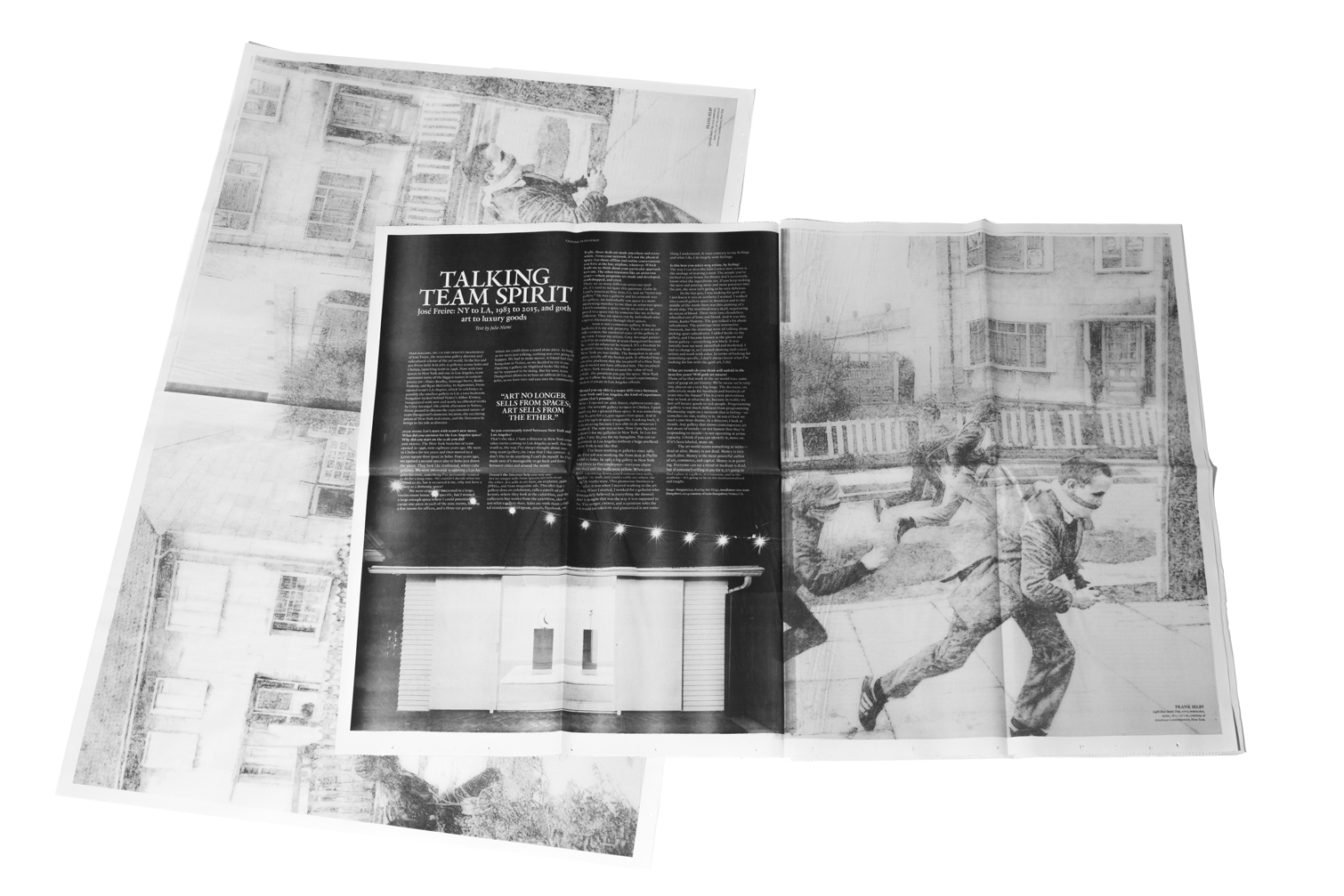
Design direction for the inaugural issue of Art Los Angeles Reader, a publication offering on-site engagement through contemporary art dialogue. The Reader explores themes of circulation and exploration, bridging editorial content with the fair’s artworks. Designed as both a newspaper and a series of posters, it transforms in experience as each page is turned.
Newsprint, 34 × 22.75 inches (folds down to 8.5 × 11 inches), black and white newsprint, loose-bound also serving as a poster set. images courtesy of Cody Cloud.
2015
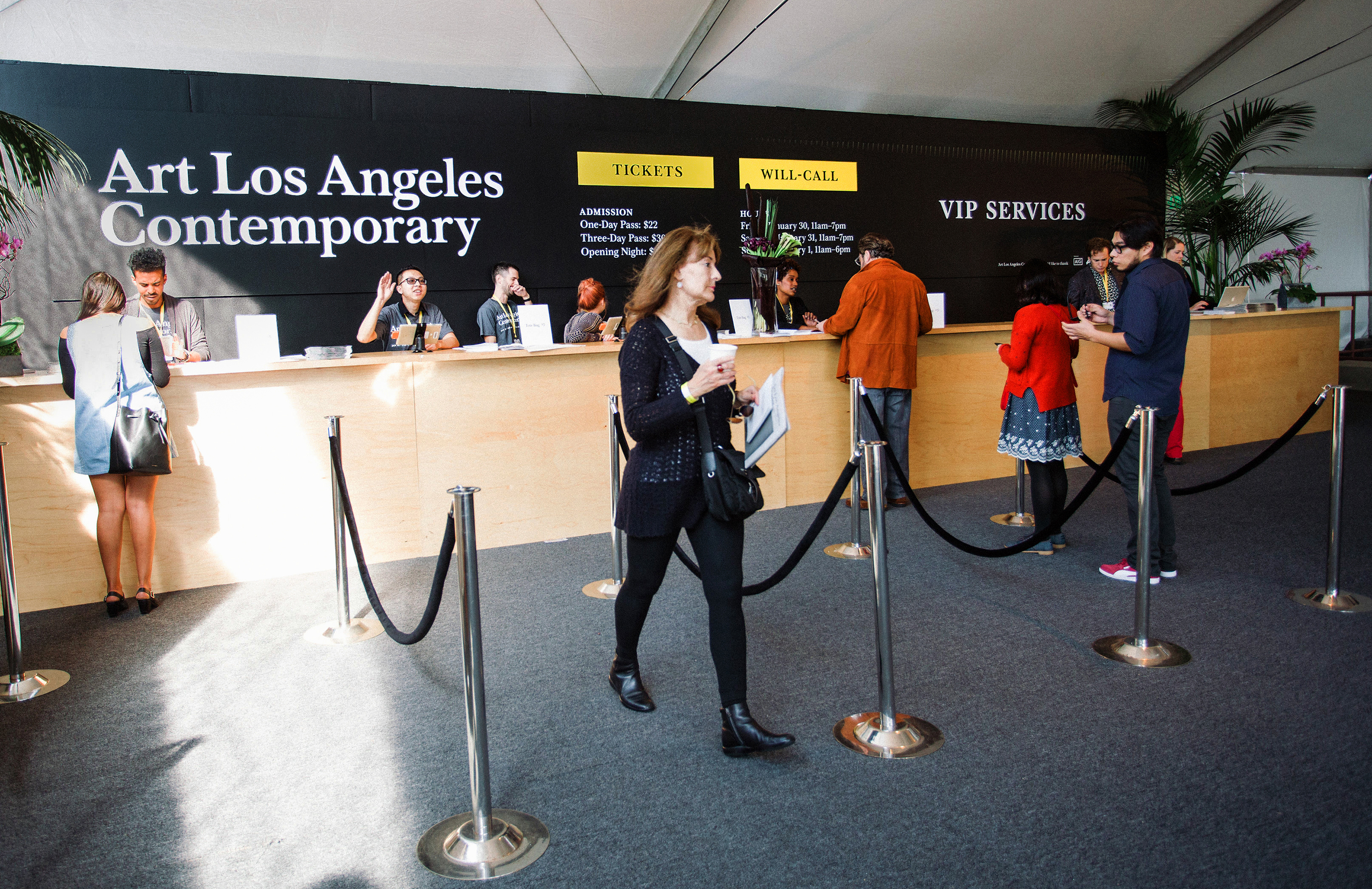
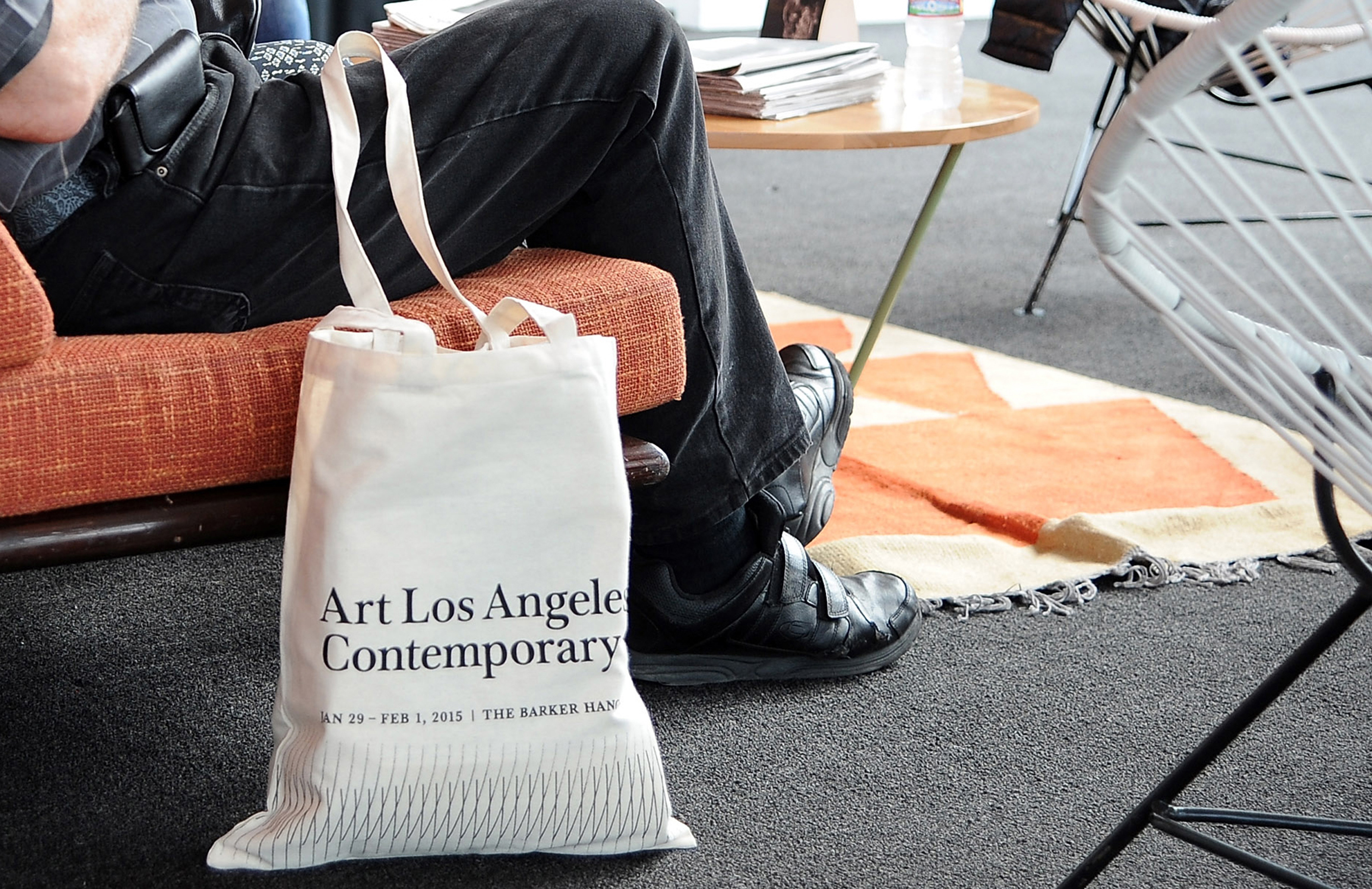
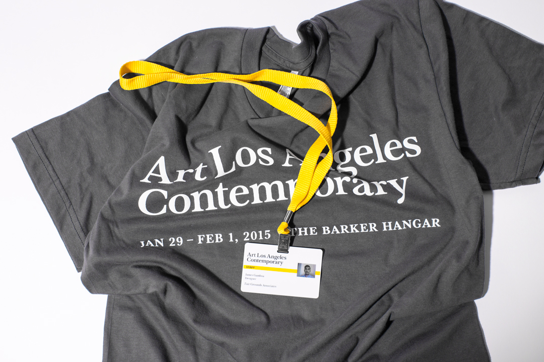
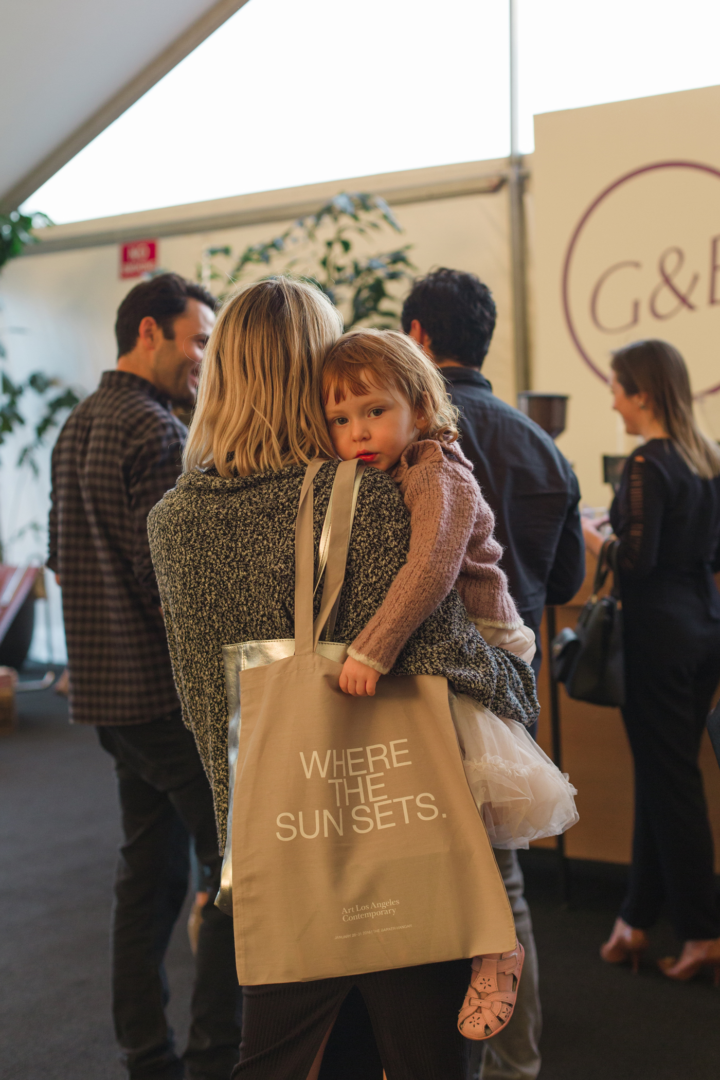
Fair exhibition identity. Design direction for graphics/title treatment, didactics, wayfinding signage, information desk and ticketing, print ads, invitations, merchandise, and various collateral.
Fairground imagery courtesy of Gina Clyne.
9 × 16 inches (folds down to 9 × 4 inches), multi-component mailer with die-cut, foil-stamped/embossed design and plastic card insert. images courtesy of Cody Cloud.